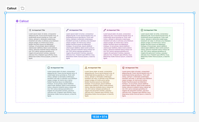
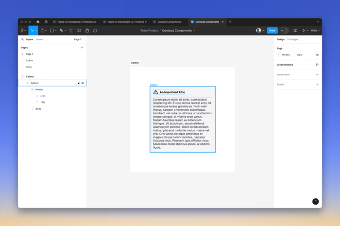
Let’s look at taking some of the concepts we’ve learned so far and creating a Callout component that we can use in our designs. Our end result will look something like this.
Surface and Border Colors
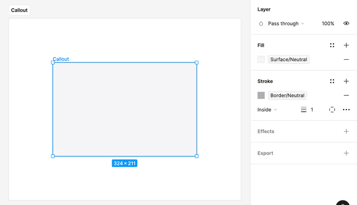
We’ll start with a basic frame, but we want to give it the background and border variables that we set up in the semantic colors section.
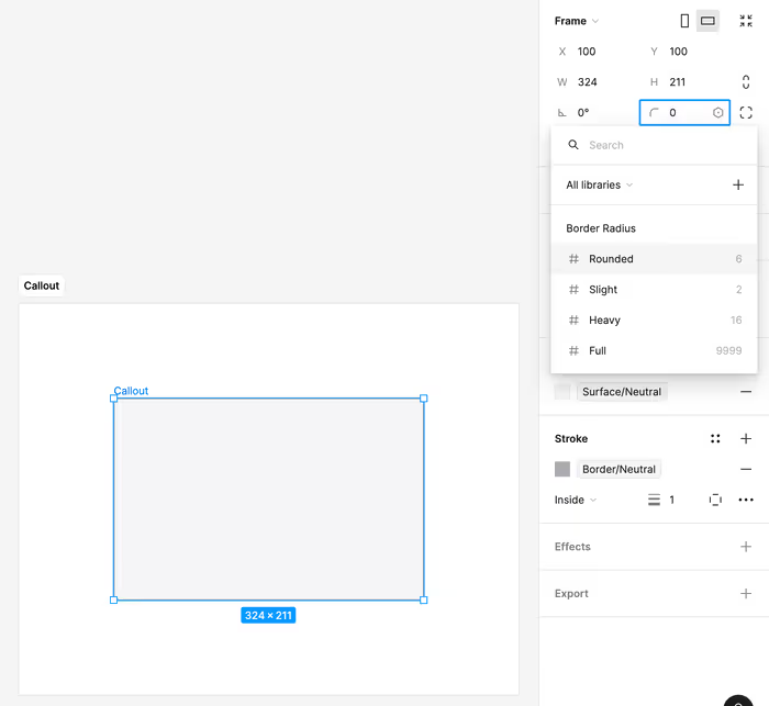
Border Radius
Next, we’ll attach our border radius variable.
Using an Auto Layout
We’re probably going to end with two auto layouts.
- One between the icon and title and the body text. This one will be the component itself.
- One for the icon and title.
Pressing Shift-A on the component will turn it into an auto layout frame.
From here we’ll use our spacing variables to set the padding and gap on the auto layout.
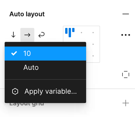
We’ll use that slight spacing between the icon and the title and then our base spacing for the padding of the callout and the spacing between the title and the body.
We now have a pretty good stating place for our callout component.
We’re ready to go ahead and select Create a component.
Setting up the Properties
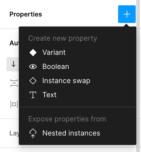
We’re going to want to expose some properties of our component in order to make it easier to work with.
Let’s expose the nested properties from the Icon. Click the + next to Properties and select Expose properties from Nested Instances.
Hiding and Showing the Body
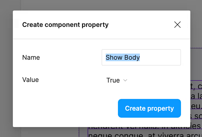
We might not always want to show the body. In this case, we can connect it to a boolean component property in order to create a toggle.
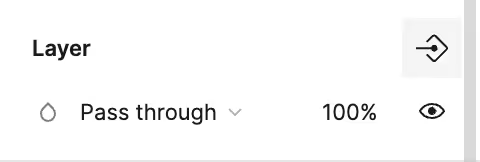
On the layer for the text of the body of the component, click on the little icon in the upper-right.
You’ll then see a prompt that has most of what you want in place.
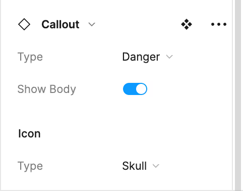
Adding Variants
We now want to add the following variants:
- Primary
- Secondary
- Success
- Info
- Warning
- Danger
You can create variants where you adjust the colors according to the semantic-colors that we set up earlier. You can also go ahead and set a default icon for each—this can be overridden with the nested properties that we set up earlier.
Extensions
In the name of time we’re going to move on, but if the spirit moves you—or, if it ends up moving me. You can take your component and apply the following:
- Some kind of shadow effect to the callout itself.
- Apply our typography styles to the title and body.