Storybook provides a Docs Block for rendering your design system’s color palette. For example, you can create a .mdx file that looks like this.
import { Meta, ColorPalette, ColorItem } from '@storybook/blocks';
<Meta title="Colors" />
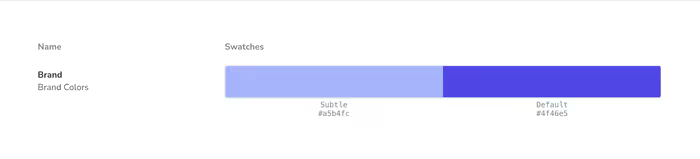
<ColorPalette>
<ColorItem
title="Brand"
subtitle="Brand Colors"
colors={{
Subtle: '#a5b4fc',
Default: '#4f46e5',
}}
/>
</ColorPalette>Storybook will render this simple color palette.
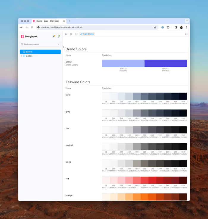
What’s even better is that you can programmatically render the color palette since you have the full power of JSX at your disposal. This allows you to easily generate a color palette based on your theme.
Let’s say we wanted to pull in all of the colors from Tailwind. We could do something like this.
import colors from 'tailwindcss/colors';
<ColorPalette>
{Object.entries(colors)
.filter(([, value]) => typeof value !== 'string')
.map(([name, value]) => (
<ColorItem key={name} title={name} colors={value} />
))}
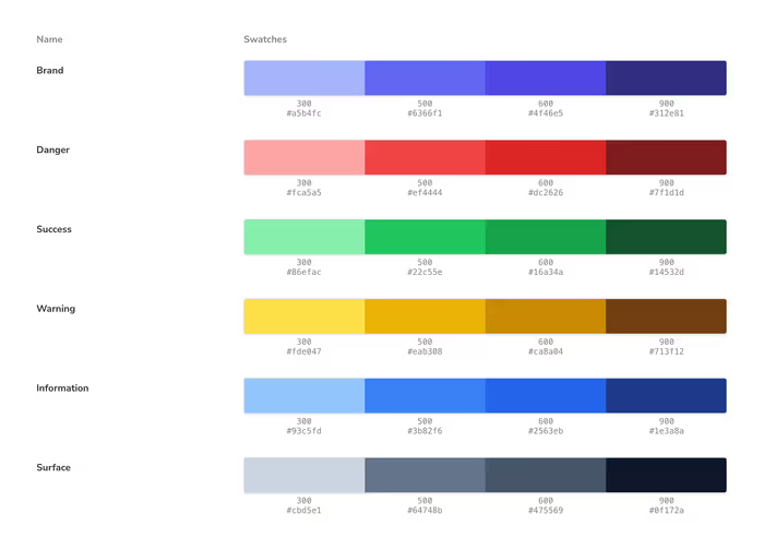
</ColorPalette>;Obviously, this will be a little different depending on the taxonomy of your theme, but you can expect something along the lines of this.
Creating a Theme of Semantic Colors
One of the things that we learned the hard way is that using color values directly can be come problematic. If you wanted to change the color of all cancelled workflows—a totally hypothetical example—you can’t just change the color in one place. You have to hunt down every time you use the color yellow and evaluate whether or not it refers to an cancelled workflow.
Your semantics will probably be unique to you, but I’ve found some common patterns in my travels. For example, you typically will have the following semantic values at the very least:
- The primary color for your brand
- A color to signify a dangerous or destructive action
- A slightly less intense color for displaying warnings
- A color to signify sweet, sweet success
- A general color for information that doesn’t relate to either danger or success
- Some set of grays for various surfaces and headings in your application.
We can set that up in our Tailwind theme and then use those values throughout our application. They can correlate to Tailwind’s built-in colors or we can create our own.
I really like uicolors.app for generating color palettes that roughly translate to Tailwind’s semantics.
Whichever route that you choose, you’ll probably end up with something that looks at least kind of like this.
import type { Config } from 'tailwindcss';
import colors from 'tailwindcss/colors';

export default {
	content: ['./src/**/*.{js,jsx,ts,tsx,mdx,html}'],
	darkMode: ['class', '[data-mode="dark"]'],
	theme: {
		extend: {
			colors: {
				primary: colors.indigo,
				success: colors.green,
				warning: colors.amber,
				danger: colors.red,
				info: colors.blue,
				surface: colors.slate,
			},
		},
	},
	plugins: [],
} satisfies Config;
Exercise
Can you take the more limited set of colors from our theme and generate a color palette? If you get stuck you can check out this potential solution.