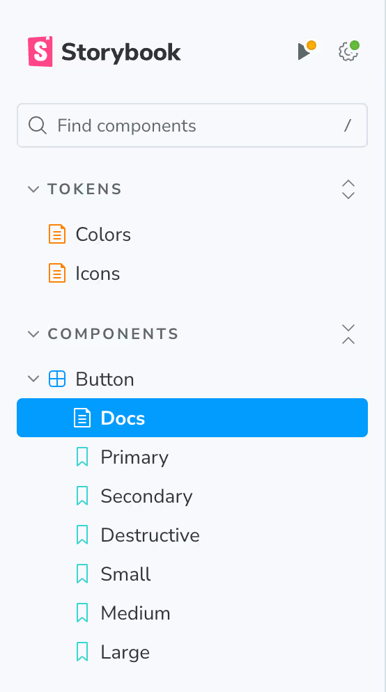
If you look at our sidebar, it’s already getting a little unorganized. Luckily, it’s pretty easy to bring some level of organization to our components. Storybook uses the way that our components are named to form some story of hierarchy.
For example, if you name a component Components/Button, it will place our Button story under the Components section. Let’s go ahead and try the following.
In src/colors.mdx:
@@ -2,7 +2,7 @@ import { Meta, ColorPalette, ColorItem } from '@storybook/blocks';
 import colors from 'tailwindcss/colors';
 import config from '../tailwind.config';

-<Meta title="Colors" />
+<Meta title="Tokens/Colors" />

 ## Brand Colors
In src/components/button/button.stories.tsx:
@@ -3,7 +3,7 @@ import type { Meta, StoryObj } from '@storybook/react';
 import { Button } from './button';

 const meta = {
-  title: 'Button',
+  title: 'Components/Button',
   component: Button,
   args: {
     children: 'Button',
In src/icons.mdx:
@@ -1,7 +1,7 @@
 import { Meta, Title, IconGallery, IconItem } from '@storybook/blocks';
 import { icons, Icon } from './components/icon';

-<Meta title="Icons" />
+<Meta title="Tokens/Icons" />

 <Title>Icons</Title>
The Result
We should now live in a much more orderly world.