Consider this super-naïve button component. Let’s say that this is in src/components/button.tsx.
import { ComponentProps } from 'react';

type ButtonProps = ComponentProps<'button'>;

export const Button = (props: ButtonProps) => {
	return <button {...props} />;
};
Next, we’ll create our first story called—unsurprisingly—button.stories.tsx.
First, import the Meta and StoryObj types to get some sweet, sweet autocompletion in TypeScript stories as well as the very responsible type safety.
import type { Meta, StoryObj } from '@storybook/react';Next, let’s import a component. In this case, the Button component.
import { Button } from './button';The default export, Meta, contains metadata about this component’s stories. The title field controls where stories appear in the sidebar.
const meta: Meta<typeof Button> = {
	title: 'Button',
	component: Button,
};

export default meta;
Each named export is a story. You’ll need at least one named export if you want to see anything.
type Story = StoryObj<typeof Button>;

export const Primary: Story = {
	render: () => <Button>Button</Button>,
};
All-in-all, your story should look something like this:
import type { Meta, StoryObj } from '@storybook/react';

import { Button } from './button';

type Story = StoryObj<typeof Button>;

const meta: Meta<typeof Button> = {
	title: 'Button',
	component: Button,
};

export default meta;

export const Primary: Story = {
	render: () => <Button>Button</Button>,
};
If you run Storybook using npm run storybook, you’ll see something like the following:
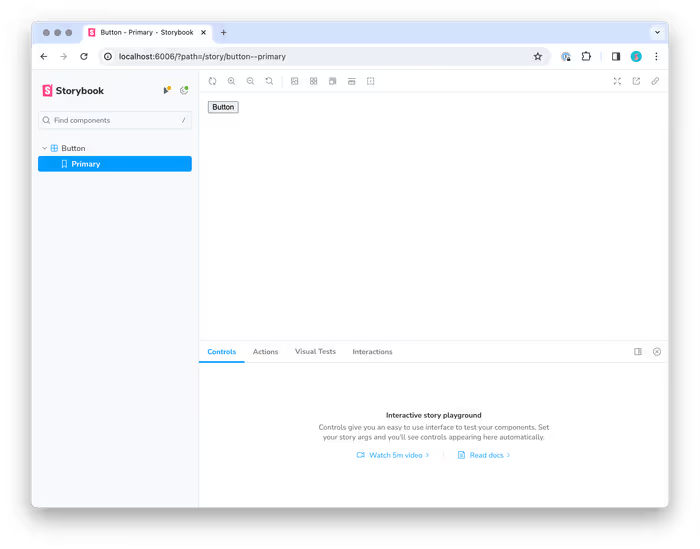 It’s not much to look at, but it’s our first story and I suppose that we had to start somewhere, right?
Using args
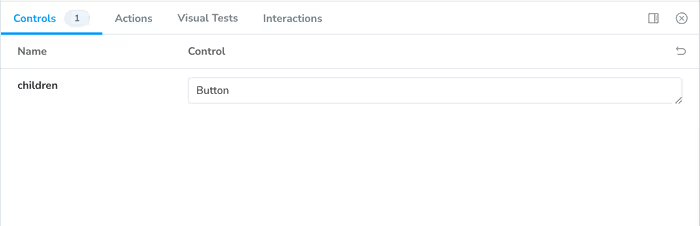
Instead of rendering the component itself, you can choose to use to an args object that will be used for the props of the component being rendered in the story. This takes advantage of Storybook’s Component Story Format.
export const Primary: Story = {
	args: {
		children: 'Button',
	},
};
You’ll notice that you can adjust the props in the Controls tab.
Our Basic Button
Here is the end result of our button at this point:
import type { Meta, StoryObj } from '@storybook/react';

import { Button } from './button';

type Story = StoryObj<typeof Button>;

const meta: Meta<typeof Button> = {
	title: 'Button',
	component: Button,
};

export default meta;

export const Primary: Story = {
	args: {
		children: 'Button',
	},
};
Right now, our Button component doesn’t do much of anything and it’s pretty ugly. Let’s add some to the button. Let’s add some variants to the story.