A lot of times it’d be nice to see what we’re implementing in the same place where we’re reviewing our implementation. If you’re using Figma, then you can integrate into your stories to make your life just a little bit easier.
We’re using Figma, but the Designs addon works with more than just Figma. You can read the full documentation here.
First, we’ll need to install another addon into Storybook.
npx storybook@latest add @storybook/addon-designsRunning this script will install the dependency as well as add it to .storybook/main.ts.
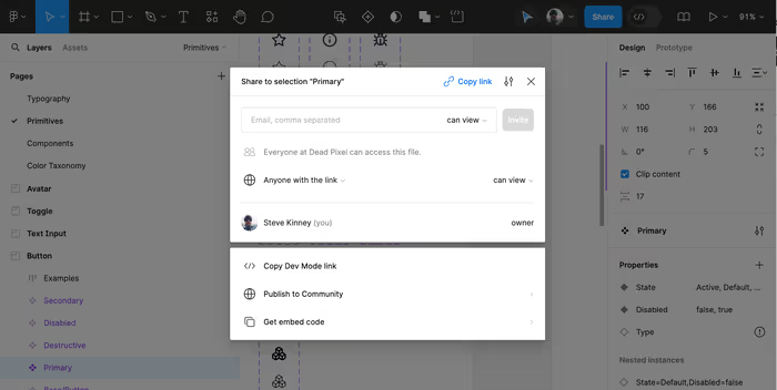
Head over into Figma and click on the Share button towards the right in the toolbar and then select Copy Link.
Next, in your story, we’re going to add a parameter that creates the link between the story and the designs.
const meta: Meta<typeof Button> = {
title: 'Button',
component: Button,
parameters: {
design: {
type: 'figma',
url: 'https://www.figma.com/file/w7qcf0DQZEQhudgeOoLbZ8/Components?type=design&node-id=24%3A177&mode=design&t=i9nPQJAFW2alh32c-1',
},
},
// …additional properties…
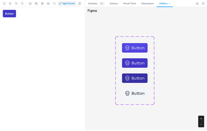
};And now, when you start up storybook, you’ll be able to see both side by side.