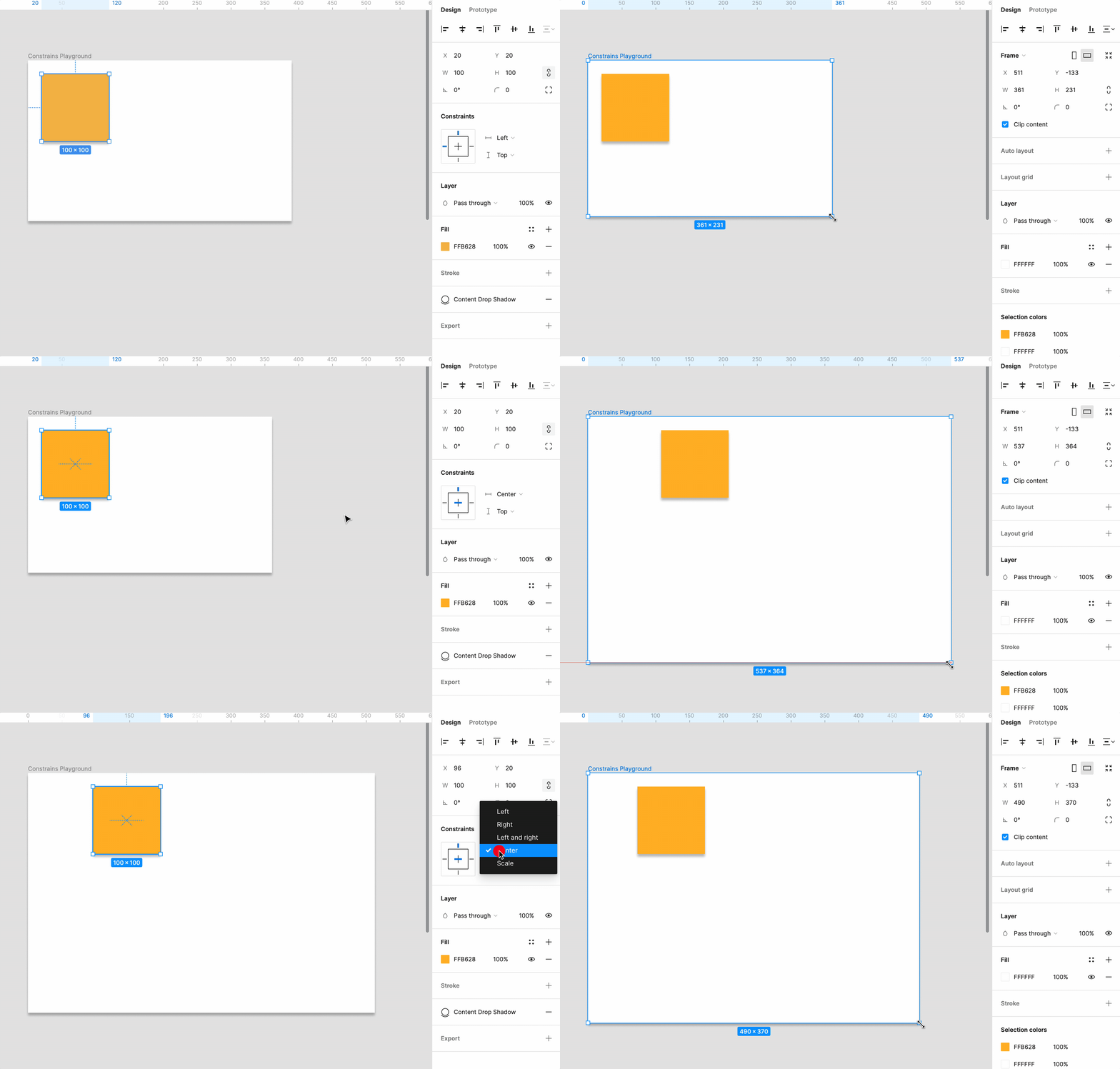
Constraints control how the layers within a frame should behave when the size of the frame changes. By default, a layer’s constraints are set to to top and left.
Pro Tip: Constraints only show up when an object is inside of a frame.
In Figma, you can use constraints to adjust how elements scale, shift, or stay in place based on the frame edges. This feature helps designers keep padding, spacing, and alignment the same on all screen sizes, making the user experience even better.
If we adjust the size of the frame to the right, you’ll see that box stays in it’s initial position. But, we can change this behavior.
Setting Up Constraints
Okay, let’s say you want to set up some constraints:
- Select an Element: Click on the element you want to apply constraints to within your frame.
- Access the Constraints Panel: In the right-hand side panel under the Design tab, locate the Constraints section.
- Configure Constraints: Choose how your element should behave horizontally and vertically. Options include:
- Top/Left: The element stays fixed to the top or left edge of the frame.
- Bottom/Right: The element remains anchored to the bottom or right edge.
- Center: The element stays centered as the frame resizes.
- Scale: The element scales proportionally with the frame.

Some Practical Applications
- Responsive Web Design: Constraints are invaluable in responsive web design, allowing UI components to adjust gracefully as browser windows resize. For instance, setting side navigation to “Left & Scale” ensures it stretches correctly, while the main content area can be set to “Scale” to utilize available space efficiently.
- Adaptive Components: Designing components like buttons and input fields with constraints means they can adapt to content changes without manual adjustment. For example, a button can be made to maintain consistent padding around its text label by setting the text to “Center” and the button background to “Scale.”
- Maintaining Aspect Ratios: For elements that must maintain their aspect ratio (like logos and icons), applying constraints appropriately ensures they scale without distortion. This is crucial for preserving brand consistency across devices.
Best Practices and Other Assorted Tips
- Nest Frames: To create complex responsive designs, use nested frames. Apply constraints within these frames for granular control over how each component behaves.
- Prototype and Test: Use Figma’s prototyping features to test how your designs adapt to different screen sizes. This real-time feedback is essential for fine-tuning your responsive designs.
- Leverage Auto Layout: Combining constraints with Figma’s Auto Layout feature can further streamline the responsiveness of your designs, especially for vertical resizing and spacing adjustments.