![]()
Any design system or application comes with a certain amount of iconography. This is always a tricky dance, you typically want as many as you need and as few as you can get away with. Again, I’ll leave the philosophy and theory to the experts and we’ll focus on the practical parts of how you can go about generating an icon library in Figma—and in another course, we’ll look at how implement these in code.
For starters, I like Lucide as a starting point for my icon library. At the time of this writing, it’s got 1,452 icons, which seems like more than enough for our purposes.
Here is our plan of attack:
- We’ll go through Lucide and select some icons that we want to use.
- We’ll create an Icon component in Figma.
- We’re make each icon a variant of that component.
Bring an Icon into Figma
There are plugins for Figma, but honestly, it’s super easy to just grab an icon as an SVG and paste it into Figma.
![]()
I’m going to copy in the following icons:
- Triangle Alert, which I will name Warn
- Bug
- Check
- Circle Check, which I will name Success
- Clipboard List
- Flame
- Circle Help, which I will name Help
- Info
- List
- Pencil
- Quote
- X
- Zap
- Plus
- Trash 2, which I will name Trash
- Skull
- External Link
- Link
- Hash
You can—and should—just steal my icons from here.
Creating the Components
If you want to make your future life easier—go and rename all of the components and prefix them with Type=, you can do this easily with Type=$&.
![]()
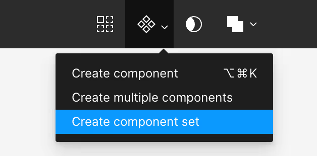
Next, we’ll select Create component set.

You will now have an component that you can rename to Icon. This give you a quick and easy list of approved icons for use in your design system.