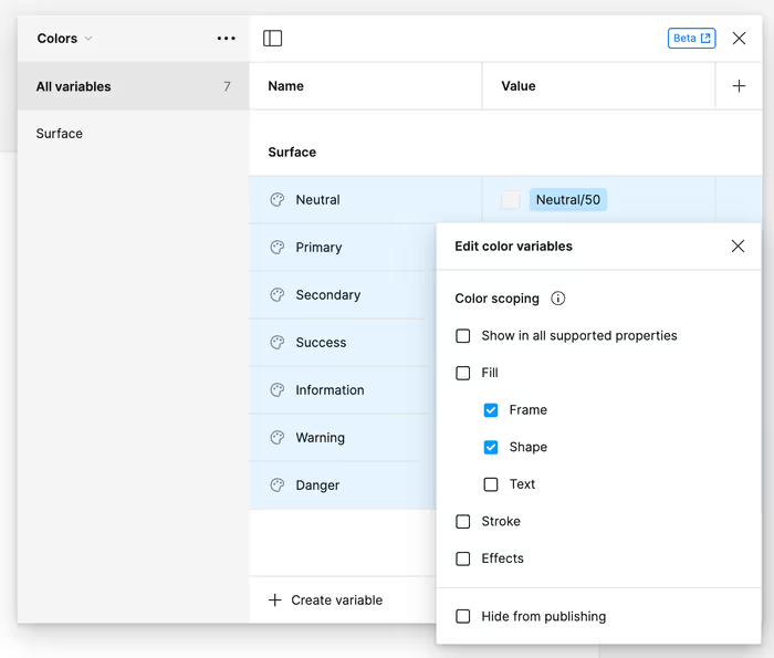
Once we have our wider color palette, it might make sense to create a curated subset of those colors that have some actual meaning. For example, we might have some callouts or alerts that we want to have a standard background color for. We can start with something like this.

You’ll notice that I’m scoping these colors just to where I expect them to be used. We can do the same for text and borders as well.
Exercise
Can you make some variables for text and border colors? Pro-Tip: We’ll likely want to let our text colors work for Shape scopes too.
- Borders should be scoped to Stroke.
- Text should be scoped to Shape and Text.