Color theory is a bit outside of the topics we’re going to cover today, but I did want to point you towards a few tools that I use when I am trying to come up with a color palette. Disclaimer: I am an engineering and not a designer.
There are two—well, really just one and a half—primary techniques for creating a color palette:
- Take some non-semantic tokens and just derive your semantic colors from there.
- Skip that step and just go with some semantic colors.
On a long enough timeline, you’ll probably end up using a lot off different colors throughout your application, so it makes sense to go with the first approach, but you always want to end up with something closer to the second.
Here is a thought exercise: Let’s assume your company’s brand is some kind of red color. So, you use red throughout your code and designs. And then, the corporate powers that be decided to do a rebrand or there is some kind of merger or acquisition. You’re going to be a lot happier as a person/team if you used brand or primary instead of red everywhere. The same goes for things like success, error, information, and danger states.
I usually start with the following semantic colors:
- Information: Often represented by a blue color, signaling clarity and calm.
- Success: Green is commonly used, suggesting safety and “go-ahead”.
- Warning: Orange or yellow, indicating caution but not immediate danger.
- Dangerous Information/Actions: Red, as it universally signals stop or error.
Generating Color Variables
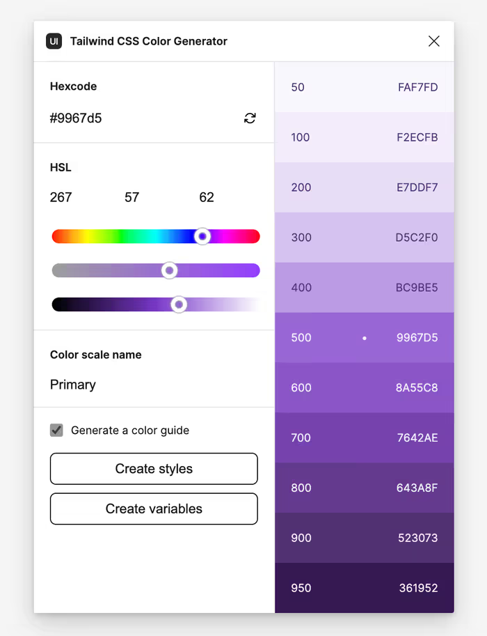
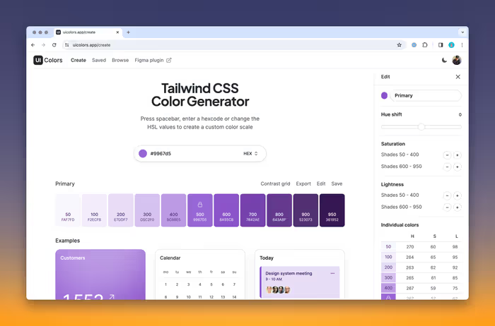
There are a lot of tools out there for generating a color palette. I really like uicolors.app. They have a really cool plugin for Figma that allows you to generate a color palette that aligns with Tailwind’s semantics. You don’t have to use Tailwind to use it either. It’s definitely a nice jumping off point to begin with.

As you can see, instantly create styles and variables along the way. You can also check Generate a color guide to create a component that allows you to easily see your color palette.
Exercise
Let’s generate a color palette with the following semantic colors:
- Primary
- Success
- Information
- Warning
- Danger
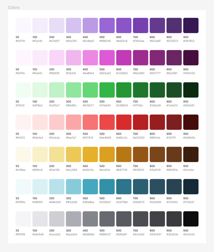
Optionally, you can create a set Neutral and Secondary colors. Use a frame and auto layout to create a style guide for your tokens. It should look something like this.

Using Colors in Code
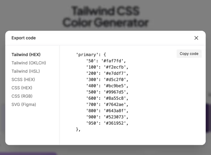
You can hook these colors up to dev-mode or export the variables, but you can also use UI Colors to create either a Tailwind theme or CSS variables that you can use in your actual code.

Clicking Export makes it easy to grab your styles as code in the format you need it.

There are also a number of other tools that you can use to get your variables out of Figma.