Adding Metadata to argTypes
Storybook tries it’s best to infer as much as it can, but the more data you add, the better table you’re going to get. Let’s walk through this example.
const meta: Meta<typeof Button> = {
	title: 'Button',
	component: Button,
	args: {
		children: 'Button',
		variant: 'primary',
		size: 'medium',
		disabled: false,
	},
	argTypes: {
		children: {
			name: 'Label',
			control: 'text',
			description: 'Text to display on the button',
		},
		variant: {
			name: 'Variant',
			description: 'Variant of the button',
			control: 'select',
		},
		size: {
			name: 'Size',
			control: 'select',
			description: 'Size of the button',
		},
		disabled: {
			name: 'Disabled',
			control: 'boolean',
			description: 'Disables the button',
		},
	},
};
Configuring the Controls Table
Each argType takes a set of parameters that isn’t necessarily about the argument or prop itself, but more about how you’d want Storybook to render the control in the table.
Hiding a Control
It’s not super helpful to have a control for the button label. We know how this works. So, we might want to hide it.
const meta: Meta<typeof Button> = {
  // Other metadata…
  argTypes: {
    children: {
      name: 'Label',
      control: 'text',
      description: 'Text to display on the button',
      table: {
        disable: true,
      },
    },
    // The rest of the argTypes…
};
Displaying a Default Value
Storybook tries it’s best to infer what a value is by default by analyzing your code, but you can also help it where it falls down. For example, we don’t ever really mentioned the disabled prop in our code, because we’re just using the built-in HTML attribute. We could add some extra information to the table.
const meta: Meta<typeof Button> = {
  // Other metadata…
  argTypes: {
    disabled: {
      name: 'Disabled',
      control: 'boolean',
      description: 'Disables the button',
      table: {
        defaultValue: {
          summary: false,
        },
      },
    },
    // The rest of the argTypes…
};
Additional, you can add even more detail, but you probably don’t need to.
const meta: Meta<typeof Button> = {
  // Other metadata…
  argTypes: {
    disabled: {
      name: 'Disabled',
      control: 'boolean',
      description: 'Disables the button',
      table: {
        defaultValue: {
          summary: false,
          detail: "Defers to the built-in HTML attribute."
        },
      },
    },
    // The rest of the argTypes…
};
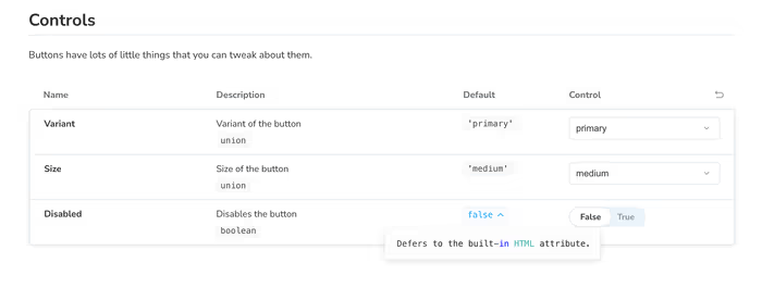
This will render a little tooltip with your additional detail.

Here is a summary of our changes so far for those of you keeping track at home.
diff --git a/src/components/button/button.stories.tsx b/src/components/button/button.stories.tsx
index 4348e02..34ba94e 100644
--- a/src/components/button/button.stories.tsx
+++ b/src/components/button/button.stories.tsx
@@ -16,21 +16,39 @@ const meta = {
       name: 'Label',
       control: 'text',
       description: 'Text to display on the button',
+      table: {
+        disable: true,
+      },
     },
     variant: {
       name: 'Variant',
       description: 'Variant of the button',
       control: 'select',
+      table: {
+        defaultValue: {
+          summary: 'primary',
+        },
+      },
     },
     size: {
       name: 'Size',
       control: 'select',
       description: 'Size of the button',
+      table: {
+        defaultValue: {
+          summary: 'medium',
+        },
+      },
     },
     disabled: {
       name: 'Disabled',
       control: 'boolean',
       description: 'Disables the button',
+      table: {
+        defaultValue: {
+          summary: false,
+        },
+      },
     },
   },
 } satisfies Meta<typeof Button>;
Additional Controls
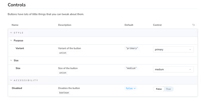
You can also use the category and subcategory properties on table to section. In order to further organize your controls. We don’t have a lot to organize right now, but I wanted to put it on your radar.
