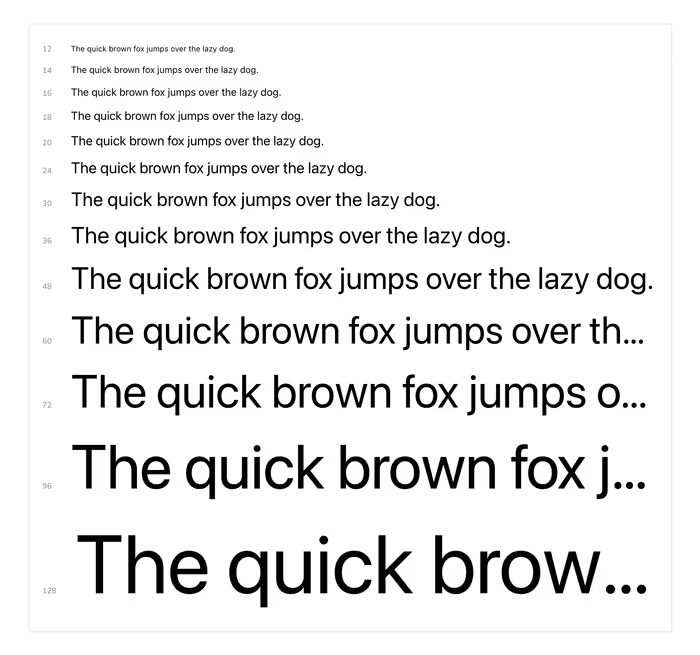
Similar to the color palettes and icon galleries, Storybook also provides a helpful set of components for rendering your design system’s typography.
import { Meta, Typeset } from '@storybook/blocks';

<Meta title="Typography" />

<Typeset
  fontSizes={[
    12,
    14,
    16,
    18,
    20,
    24,
    30,
    36,
    48,
    60,
    72,
    96,
    128
  ]}
  fontWeight={400}
  sampleText={"The quick brown fox jumps over the lazy dog."}
  fontFamily={"system-ui, sans-serif"}
/>
You’ll see something along these lines.
