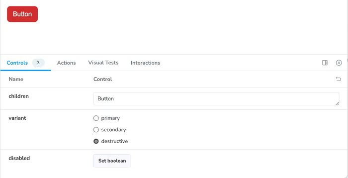
In the last section, we added styles for the button when it was in disabled state, but we don’t have a particularly good way to trigger that in our stories. We could add additional stories for the disabled state of each of our button variants, but that feels like it might get out of hand.
Luckily for us, Storybook allows us to create custom controls that we can manipulate on our stories.
All that we need to do is add the following to the Meta of our story.
const meta: Meta<typeof Button> = {
	title: 'Button',
	component: Button,
	argTypes: {
		disabled: {
			control: 'boolean',
			description: 'Disables the button',
		},
	},
};
Now, you’ll notice that we have the ability to set that property in our controls.

We have to click on it in order to set it. If we don’t want to do that, we can set the value in each of our stories.
export const Primary: Story = {
	args: {
		children: 'Button',
		variant: 'primary',
		disabled: false,
	},
};

export const Secondary: Story = {
	args: {
		children: 'Button',
		variant: 'secondary',
		disabled: false,
	},
};

export const Destructive: Story = {
	args: {
		children: 'Button',
		variant: 'destructive',
		disabled: false,
	},
};
And how, we’ll see that it’s set and we can save one extra click. I’ll leave it up to you to decide if that’s worth it or not.

An Alternative Approach for Setting a Default Value
One of the cool things about Storybook stories is that they’re just ES Modules. You could use the spread operator if you find yourself needing to make wide-scale changes often. This is helpful if we want to use aspects of one story in the context of another story.
export const Primary: Story = {
	args: {
		children: 'Button',
		variant: 'primary',
		disabled: false,
	},
};

export const Secondary: Story = {
	args: {
		...Primary.args,
		variant: 'secondary',
	},
};

export const Destructive: Story = {
	args: {
		...Primary.args,
		variant: 'destructive',
	},
};
That said, there is also a way to use default arguments that are passed to every story and then overriding them when needed. But, first, let’s do a little exercise.