Storybook allows you to document components using MDX, which is basically just Markdown + JSX.
This allows a lot more flexibility when it comes to how you display your components, stories, controls, and—of course—documentation.
Your components and stories can be in any framework that Storybook supports, but your MDX files will use React.
By default, MDX will pick up any .mdx files in your project. But, you can configure it, if you want.
import type { StorybookConfig } from '@storybook/react-vite';

const config: StorybookConfig = {
	/**
	 * Change the setting below if you want to be a bit more specific
	 * about where you want Storybook to go looking for MDX files.
	 */
	stories: ['../src/**/*.mdx', '../src/**/*.stories.@(js|jsx|mjs|ts|tsx)'],
	// The rest of your configuration…
};
export default config;
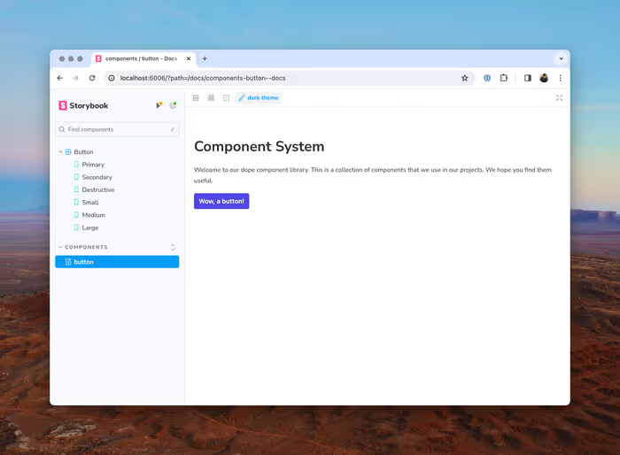
Let’s start with something simple just to demonstrate how MDX works and then we’ll get into some of the more specific Storybook-related tricks. Let’s create src/components/button/button.mdx.
import { Button } from './button';

# Component System

Welcome to our dope component library. This is a collection of components that we use in our projects. We hope you find them useful.

<Button>Wow, a button!</Button>
Doc Blocks
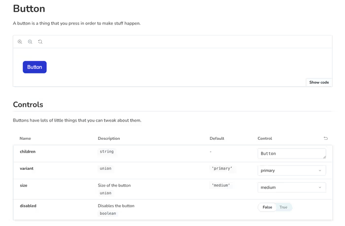
The real power—or, at least the Storybook-related power—comes mixing in @storybook/blocks into your documentation. Doc blocks allow you to take pieces of the stories that we’ve been working with so far and integrating them into your prose.
import { Meta, Title, Primary, Controls, Story } from '@storybook/blocks';
import * as ButtonStories from './button.stories';

<Meta of={ButtonStories} />

<Title>Button</Title>

A button is a thing that you press in order to make stuff happen.

<Primary />

## Controls

Buttons have lots of little things that you can tweak about them.

<Controls />
Let’s talk about what’s going on here:
- We’re importing all of the exports from our button stories.
- We’re importing the
Metablock from@storybook/blocksin order to attach our documentation to our component. - The
Primaryblock renders the first-defined story in ourbutton.stories.tsxfile. It’s purely coincidental that it happens that my first export is also named Primary. - There is some more prose and then re render the
Controls, which is analogous to what we’ve seen so far.
