Almost everything in this section can be applied to any stylesheets that you happen to be using in your application, but since we’re going to be using Tailwind in our design system, this has a mild-Tailwind flavor to it, but the content itself applies more broadly.
There are plenty of reasons why you might consider using Tailwind and equally as many as to why it might not be the best fit. I did my best to outline my thinking here.
Integration with Tailwind—or, honestly—any other styles that you have set up is fairly easy with Storybook.
You can skip this step if you’re following along with our example repository. I’m just including this here for your reference later.
If you need to install Tailwind, you can run the following:
npm install -D tailwindcss postcss autoprefixer
npx tailwind init --ts -p
Adding Your Styles to Storybook
In .storybook/preview.ts, simply import any stylesheet that you want to include in your stories. These will only be applied to the canvas and not to the entire Storybook UI.
diff --git a/.storybook/preview.ts b/.storybook/preview.ts
index adcda96..6725718 100644
--- a/.storybook/preview.ts
+++ b/.storybook/preview.ts
@@ -1,5 +1,7 @@
 import type { Preview } from '@storybook/react';

+import '../src/index.css';
+
 const preview: Preview = {
   parameters: {
     controls: {
Supporting Dark Mode
Tailwind comes with support out of the box for Dark Mode. Tailwind defaults to using the browser’s preferences (using the prefers-color-scheme media query) to determine if it should render content in dark mode, but it also allows you to determine if you’d prefer to trigger dark mode using a CSS selector.
We’re going to want to toggle between light and dark mode without needing to adjust our browser settings. So, let’s set that up.
diff --git a/tailwind.config.ts b/tailwind.config.ts
index bc8a713..5015364 100644
--- a/tailwind.config.ts
+++ b/tailwind.config.ts
@@ -2,6 +2,7 @@ import type { Config } from 'tailwindcss';

 export default {
   content: ['./src/**/*.{js,jsx,ts,tsx,mdx,html}'],
+  darkMode: ['class', '[data-mode="dark"]'],
   theme: {
     extend: {},
   },
Using the Storybook Themes Addon
Storybook’s CLI has a helper to both install addons as a dependency as well as add the addon to .storybook/main.ts.
npx storybook@latest add @storybook/addon-themesYou will be asked the following question:
? How do you toggle themes? › - Use arrow-keys. Return to submit.
❯   CSS class
    Data attribute
If you need to set this up manually, you can add the following to .storybook/main.ts.
diff --git a/.storybook/main.ts b/.storybook/main.ts
index 098b7b7..63965e0 100644
--- a/.storybook/main.ts
+++ b/.storybook/main.ts
@@ -8,6 +8,7 @@ const config: StorybookConfig = {
     '@storybook/addon-essentials',
     '@chromatic-com/storybook',
     '@storybook/addon-interactions',
+    '@storybook/addon-themes',
   ],
   framework: {
     name: '@storybook/react-vite',
Using a Data Attribute
We chose to use a data attribute for dark mode, but you could also use a class. Your mileage may vary, but my mileage is informed by adding dark mode to a legacy code base. So, I am going to opt to use a data attribute.
diff --git a/.storybook/preview.ts b/.storybook/preview.ts
index 6725718..f68d778 100644
--- a/.storybook/preview.ts
+++ b/.storybook/preview.ts
@@ -1,4 +1,5 @@
 import type { Preview } from '@storybook/react';
+import { withThemeByDataAttribute } from '@storybook/addon-themes';

 import '../src/index.css';

@@ -11,6 +12,16 @@ const preview: Preview = {
       },
     },
   },
+  decorators: [
+    withThemeByDataAttribute({
+      defaultTheme: 'light',
+      themes: {
+        light: 'light',
+        dark: 'dark',
+      },
+      attributeName: 'data-mode',
+    }),
+  ],
 };

 export default preview;
Like I said, either answer is fine depending on your settings. I don’t have a strong opinion outside from the experience of migrating an existing code base and finding out the hard way that dark was already being used for other purposes, so I’m going to go with the data attribute.
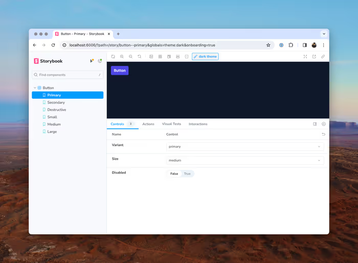
If all goes well, you should see something like this:

In addition to installing the dependency, this will make the following changes to your Storybook configuration.
- It will add
@storybook/addon-themesto your list ofaddonsin.storybook/main.ts. - It will configure a decorator in
.storybook/main.ts.
